Memphis Style Lager
Memphis Style Lager
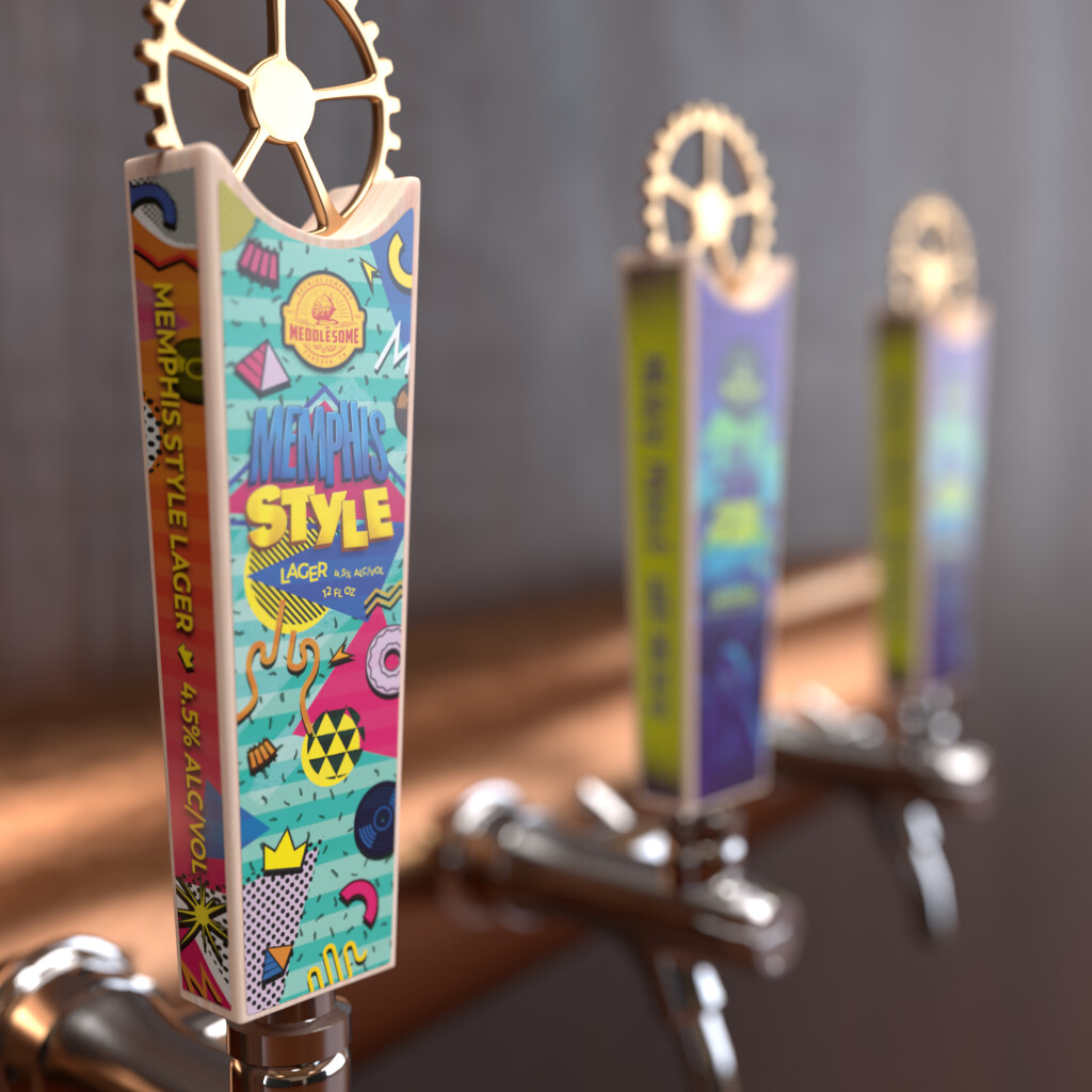
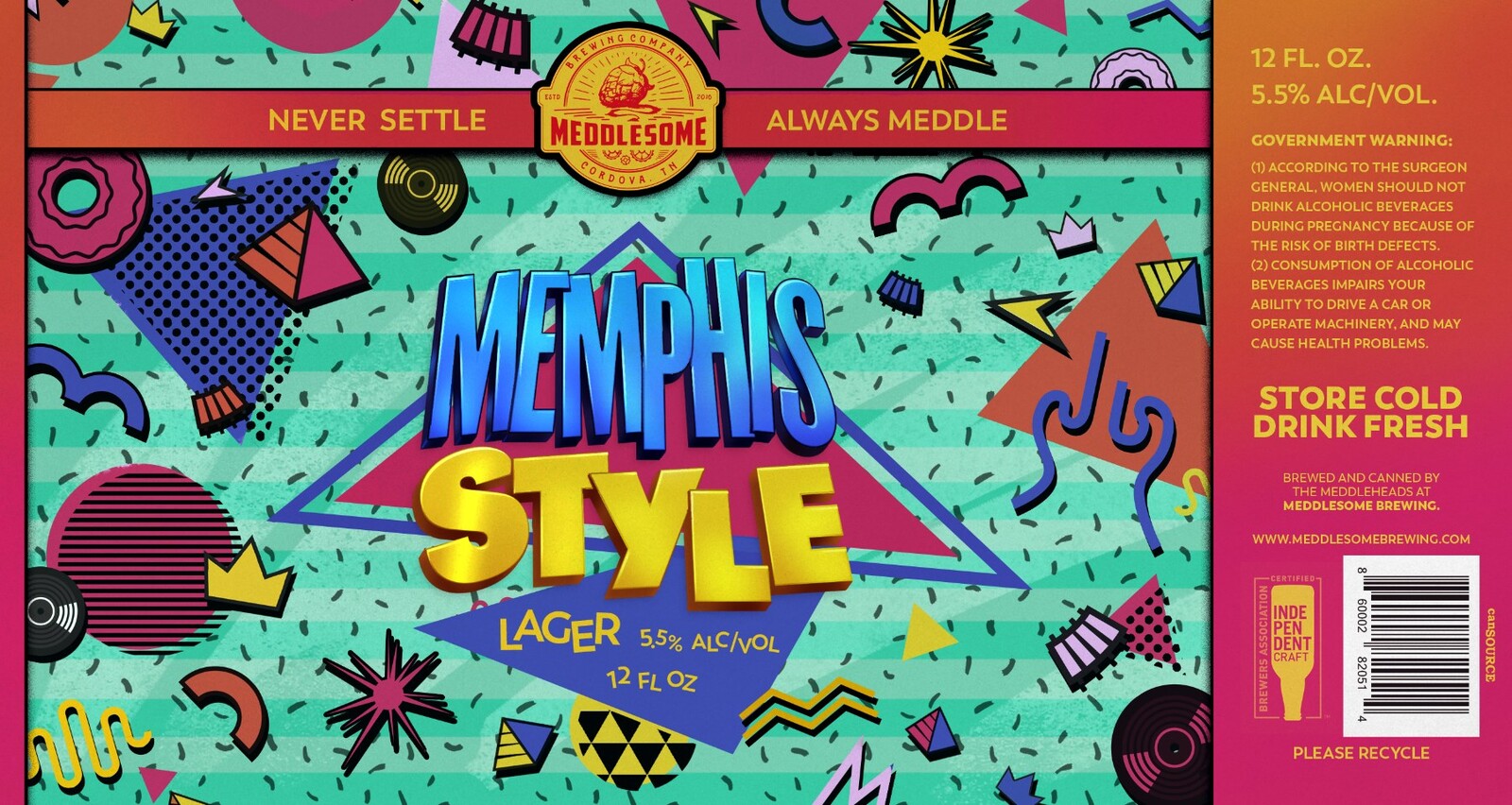
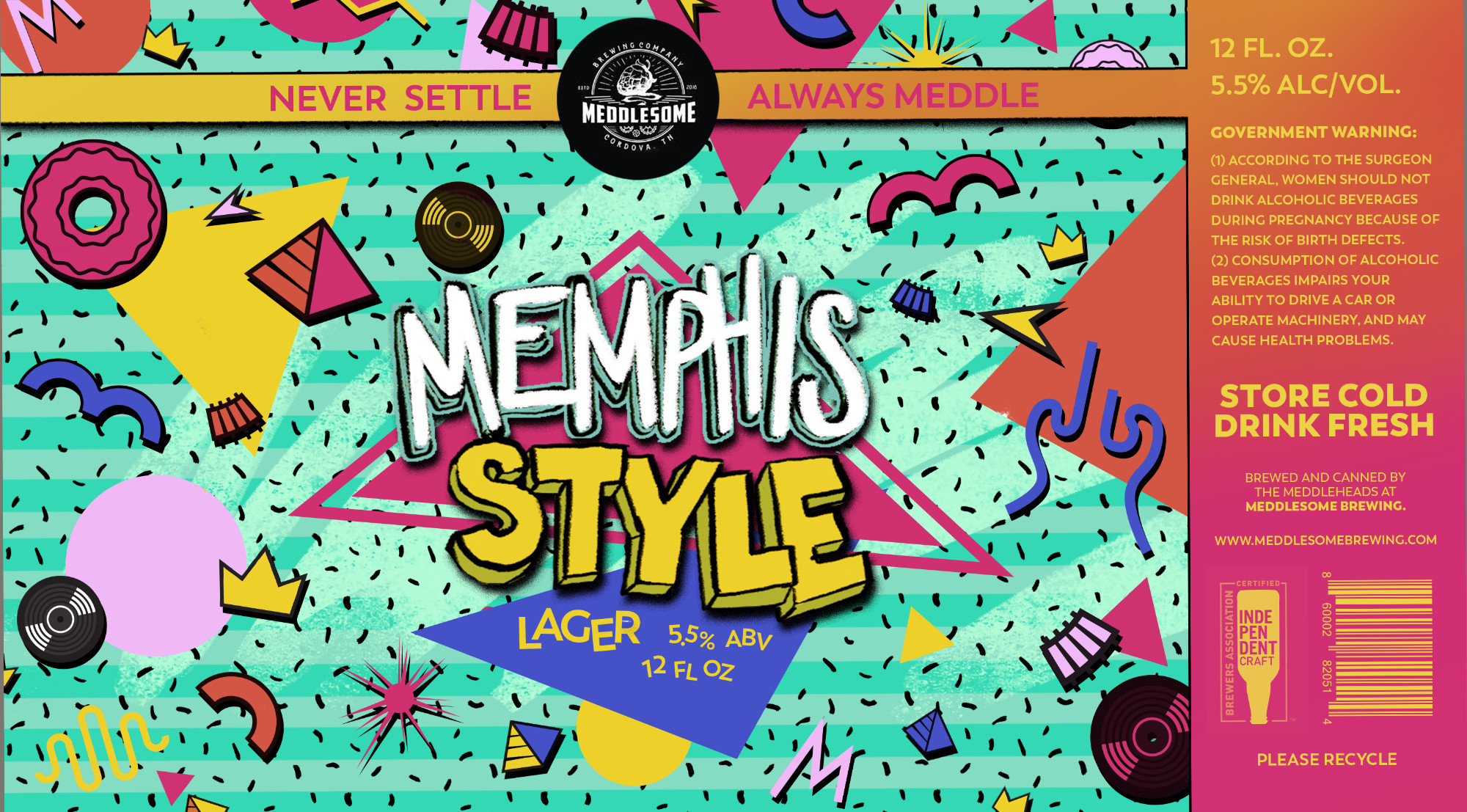
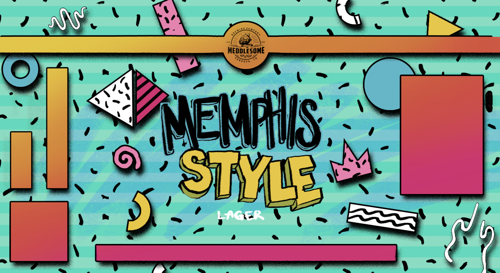
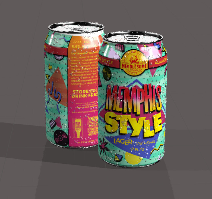
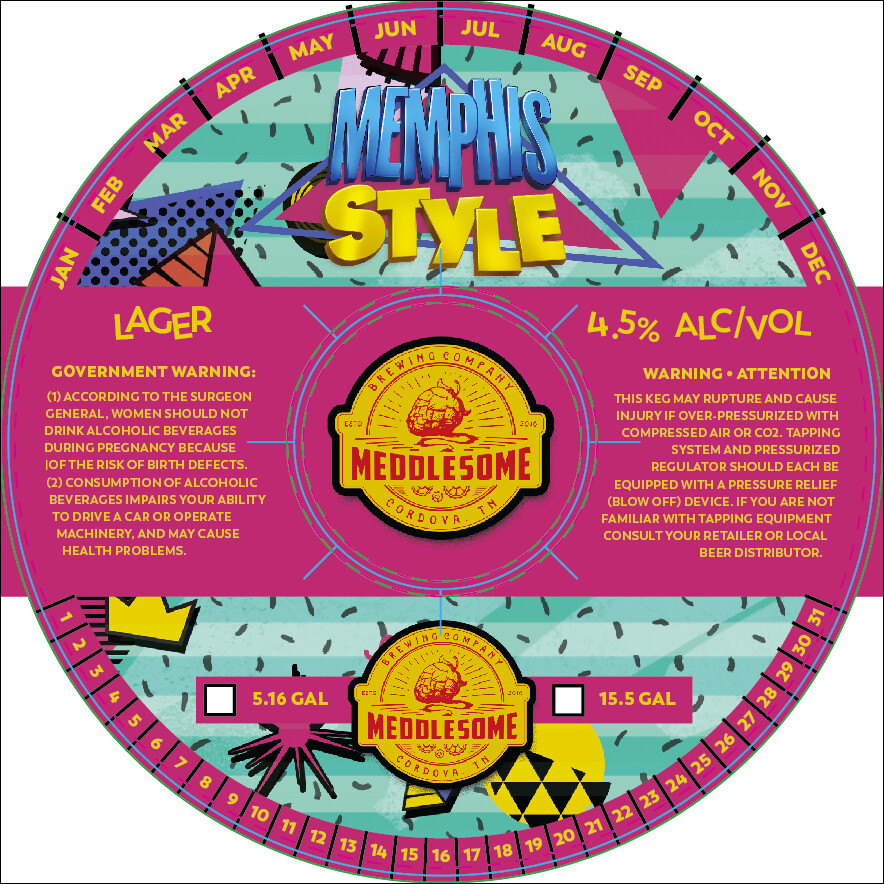
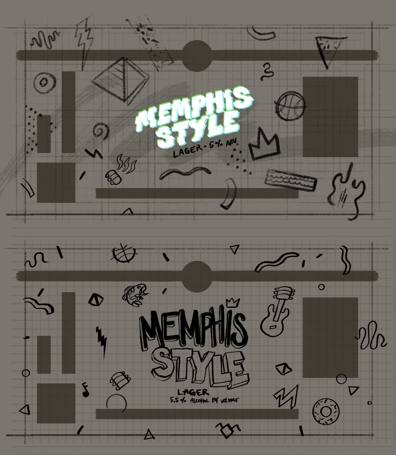
The concept here was to tip the hat to Memphis style design of the 80s/90s, something which had nothing to do with Memphis, TN, and pull it into a local meaning. So using iconography relating to the city we would create a design in that vein. Then I went full Saved by the Bell with the typography.


